
House prices in Oxfordshire 2025
Who among us doesn’t sneak a quick look at house prices now and then – whether it’s to eye up your dream home or just to find out what’s happening where you currently live?
Where to live, where to work, where to shop and where the kids go to school is a very personal choice. But it’s a choice that affects our lives and the lives of everyone in the county through the homes that we live in, the infrastructure that supports them, and journeys between them. We have provided a whole week of articles about housing in Oxford and another about the infrastructure. Today we are putting the Clarion lens over that great topic of interest that is house prices.
We've taken the full year of housing transactions data for 2025, more data going back to 2008, data to calibrate it for house size (see the method note below), and our in-house data analyst (#WeAreAllTheClarion) has been looking into the changes and trends.
The 2025 transactions data show another good year for affordability in most parts of the county. Apart from Cherwell and West Oxfordshire, house prices in most of the county were stagnant or fell. In South Oxfordshire this was by 1.6% compared to 2024.
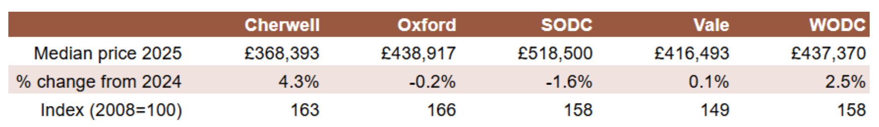
Inflation was about 2.4% in this period using the Consumer Price Index (CPI), so Cherwell house prices were rising ahead of inflation and West Oxfordshire house prices rose at about the rate of inflation.
Although median prices were stagnant in Oxford last year, they have climbed the most among Oxfordshire districts since the financial crisis (2008). Within Oxford, neighbourhoods in East Oxford have exhibited the fastest price rises since the pandemic (2020).
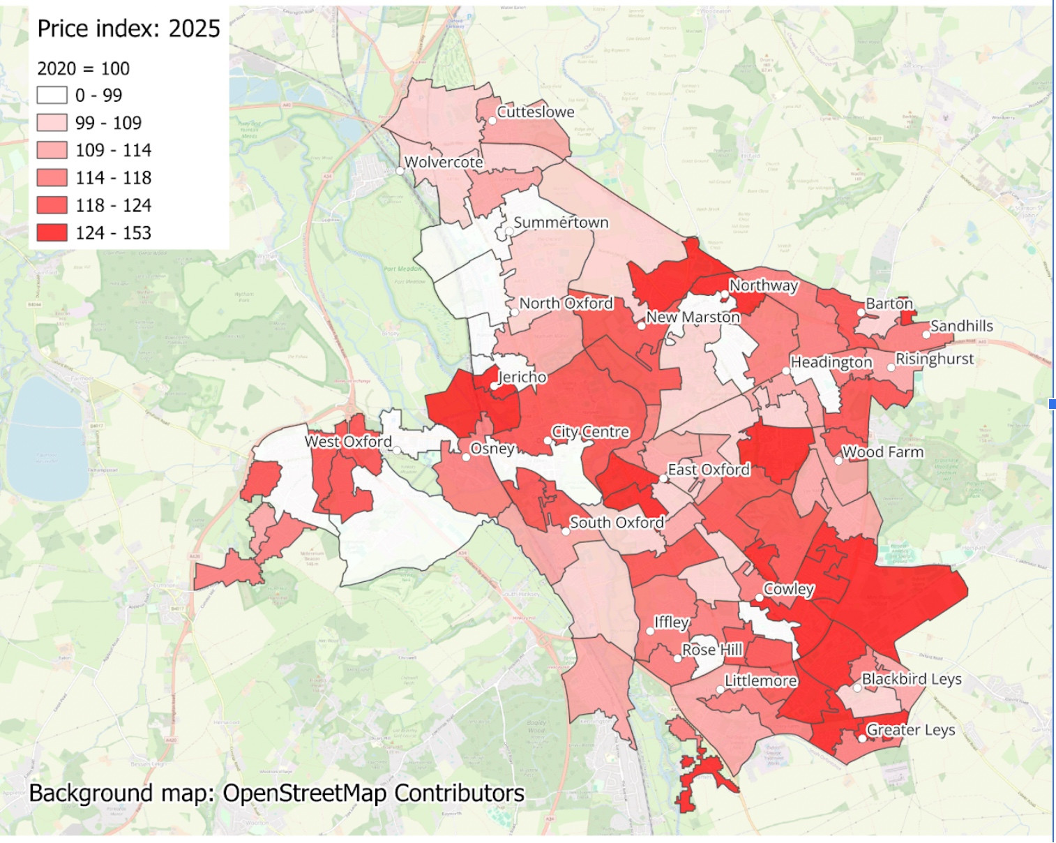
The map above shows house price changes since 2020, with the areas of largest increase in southeast Oxford, and around the centre. CPI inflation over this period was 27%, so all but the darkest shaded areas have become cheaper in real terms.
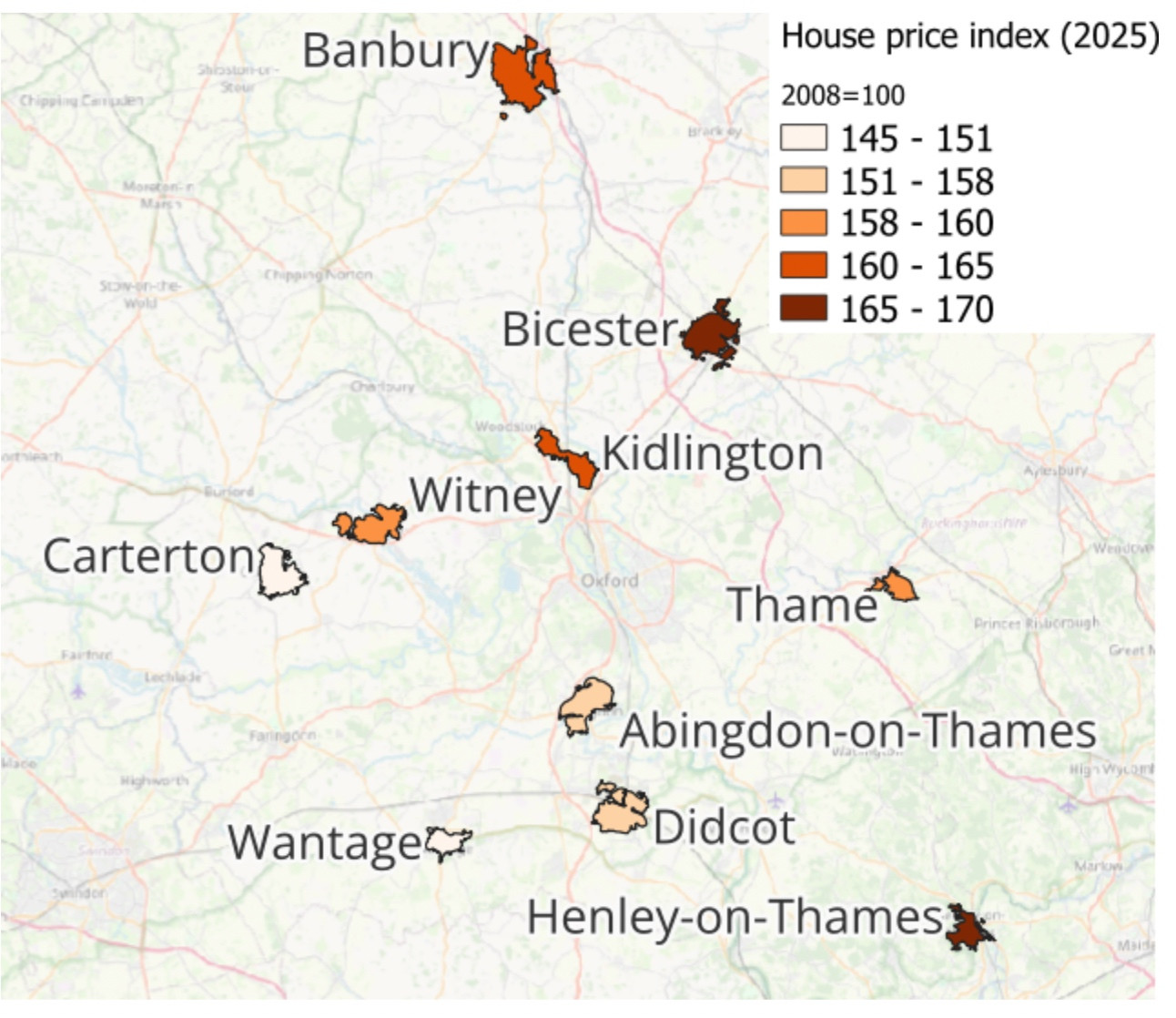
Looking more widely across the county, house prices in Oxfordshire towns have seen widely divergent bounce-backs from the pandemic. Bicester prices are 70% above 2020 levels; Wantage prices are 45% higher. Both Bicester and Wantage have seen large amounts of recent house-building. Again, the lighter shaded areas have become cheaper in real terms.
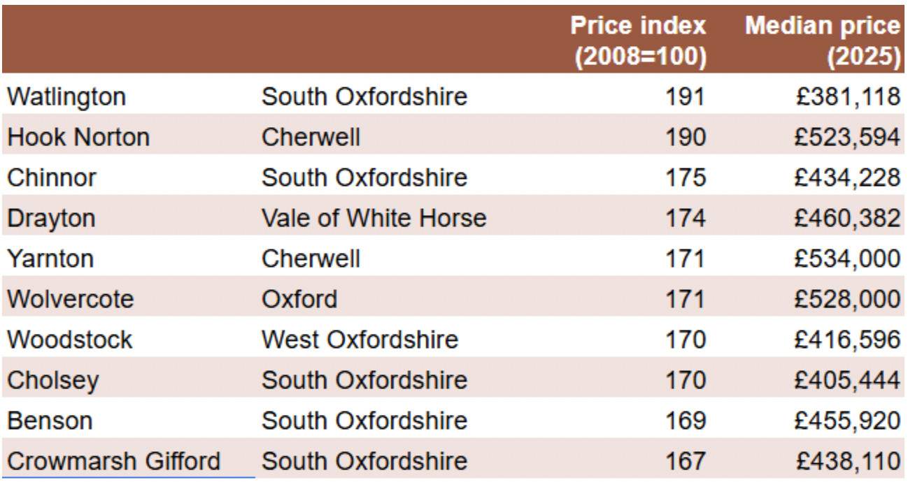
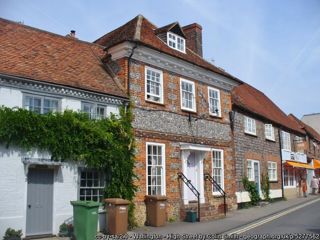
In the villages, half of Oxfordshire's fastest-rising house prices are located in South Oxfordshire. Watlington takes top spot, with a near doubling in median house prices since the pandemic. Hook Norton in Cherwell was nearly as fast-rising, and far more pricey at a median £523,600 per home.
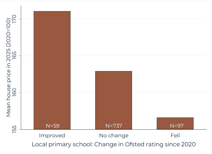
Looking across Oxfordshire, it's notable that changes in local primary school Ofsted ratings are highly correlated with neighbourhood level house prices. While not evidence of causation, this chart won't dispel the notion that local schools are the key to attracting more people to the local area.
Our analysis used a matching algorithm to join HM Land Registry price data to Environmental Performance Certificate data, to derive price per square foot. Adjusting for area in this way avoids the results being distorted by trends in home size. Medians of this were taken at the neighbourhood level, per year, allowing a picture of localised house price trends. Medians were chosen over means so a small number of large transactions did not distort the results.
The analysis first appeared as a thread on our Bluesky channel.